Most people think of designing a logo with a graphic element, but I believe that the font is the most important element to consider. Your logo font plays a crucial role in defining your brand’s visual identity. Invest time and effort into selecting a font that resonates with your brand, stands out, and captures the attention of your target audience.
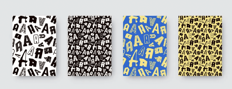
Different fonts have unique attributes and personalities. Potential customers will make assumptions about your business based on the font used in your logo. Therefore, it is vital for your logo font to align seamlessly with your brand in order to deeply resonate with your audience, especially in the field of logo design.
While you can use different fonts in various design materials, it’s essential to understand that your logo font will be strongly associated with your brand. Consider how the font will perform not only during the first impression but also with repeated exposure. This will ensure a lasting impact on customers and help build a strong brand identity.
The font used in your logo can evoke various associations and prompt assumptions about your brand identity. Here are some factors that audiences may consider when evaluating your logo font:
- Personality and Tone: Different fonts have distinct personalities, such as elegant, playful, bold, or professional. Audiences may associate these traits with your brand and form assumptions about your overall tone and character.
- Industry Relevance: Certain fonts align more naturally with specific industries. For example, a sleek and modern font might be suitable for a technology company, while a classic and traditional font may be more fitting for a law firm. Audiences may draw connections between the font style and your industry.
- Brand Values: Fonts can communicate underlying brand values such as creativity, reliability, innovation, or tradition. The choice of font can influence the perceived values of your brand and shape audience perceptions.
- Target Audience: Understanding your target audience is essential in selecting a logo font. Consider their preferences, demographics, and cultural context. A font that resonates with your target audience can enhance brand recognition and appeal.
- Legibility and Versatility: Ensure that the chosen font is easily legible in various sizes and formats. A versatile font that retains clarity across different applications will help maintain brand consistency and recognition.
By considering these factors, you can make informed decisions when choosing a logo font that aligns with your brand identity. Keep reading to discover the typefaces that best suit your brand and its unique characteristics.
Size Does Matter!
Choosing the right font size so that it’s scalable on your t-shirts, signage and promotional products is important.
Logo Parameters
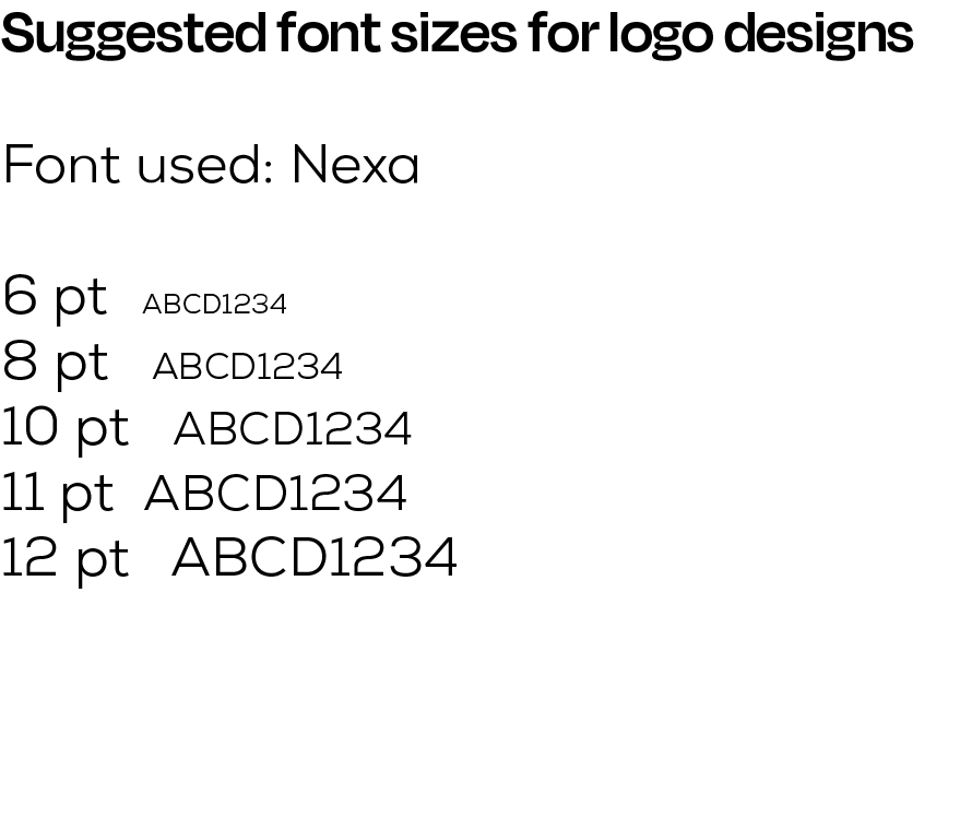
The smallest average is around 6pt, but it will vary depending on what custom products you’re ordering. The font size is important because it could affect the readability of your text. For instance, the letter “o” could end up being filled in with ink if you go too small. Your tiny trademark (TM) and (c) copyright symbols will just look like a blob.
Technical considerations
For maximum readability—especially from a distance—consider a font that can be kerned out.
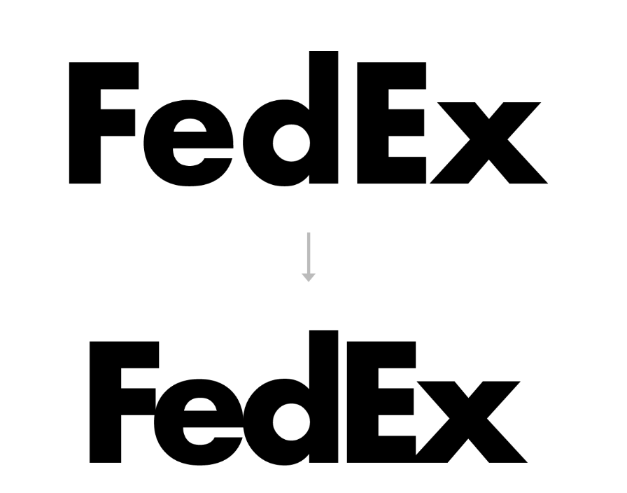
Kerning describes the process of putting space between letterforms in order to create a visually please and legible result. Sans serifs in particular retain their readability when they are kerned out with a lot of white space. A script relies on each letter touching the other forms and the white space should never be increased.
At the same time, be wary of fonts that feel too overdone. Retro slab serifs are so popular with breweries that they’ve ceased to stand out. Same with characterless sans-serifs for tech companies. There’s a balance that needs to be struck between recognizable and overdone. You want a logo that feels in-line with competitors but also still feels fresh.
Tips on font sizes that print the best on apparel
- The bare minimal readable font size for a san serif font is 6 pt
- A comfortable reading font size for printed materials is 12 pt
- Contrast of the logo – do the squint test or readability at a glance. Consider a light or dark background to help create the right mood and feeling for the logo design.
- Logos that are small read better when they are designed horizontally
- Round and square logo usually require an alternate, matching elongated text logo version for better readability when rendered at only 1/4” tall or smaller (pens, pointers, clickers, fobs, air pods)
- Business card with a secondary detail copy should not be any smaller than 6 pt
- Your logo text should be around 11 pt when it’s on a business card and list their mailing or physical address in 9 pt. It also depends on the font style for an effective card layout.
Embroidery and Woven Labels

- A lot of the same considerations for print and silk screen apply to embroidery
- Keep in mind that the needle is going up and down and punching a hole through the material, so every curve and detail may not show up.
- Detailed outlines or strokes around text need to be at least a 2pt
- Remove Trademark and (c) ™ and copyright symbols – a lot of times we drop this on embroidery, it’s just too small and looks like a blob
Sublimation Printing
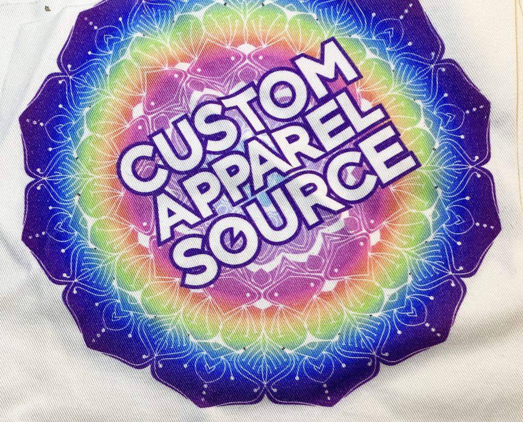
Logos with multiple colors or gradients are idea for sublimation t-shirts, jerseys and more. Since sublimating is printed using the CMYK formula, you can submit your artwork either as a photoshop file or vector. It can be made with multiple colors can retain the smallest of detail, but again is limited to whether anyone can really see it. We are the industry’s top sublimation design and apparel company.


How to choose the right font for your logo
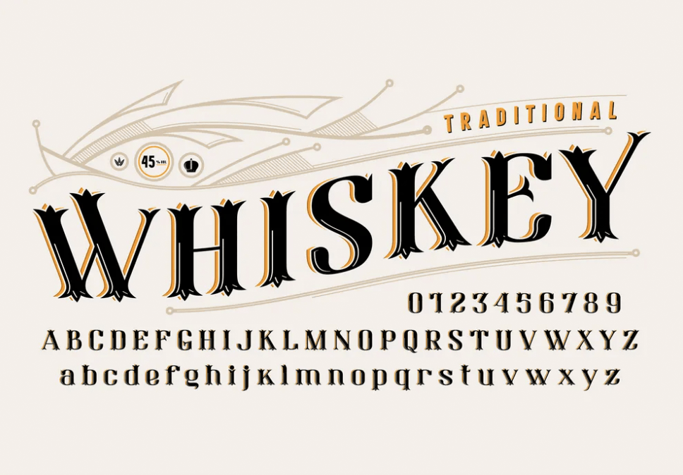
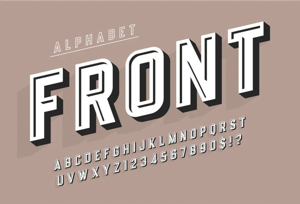
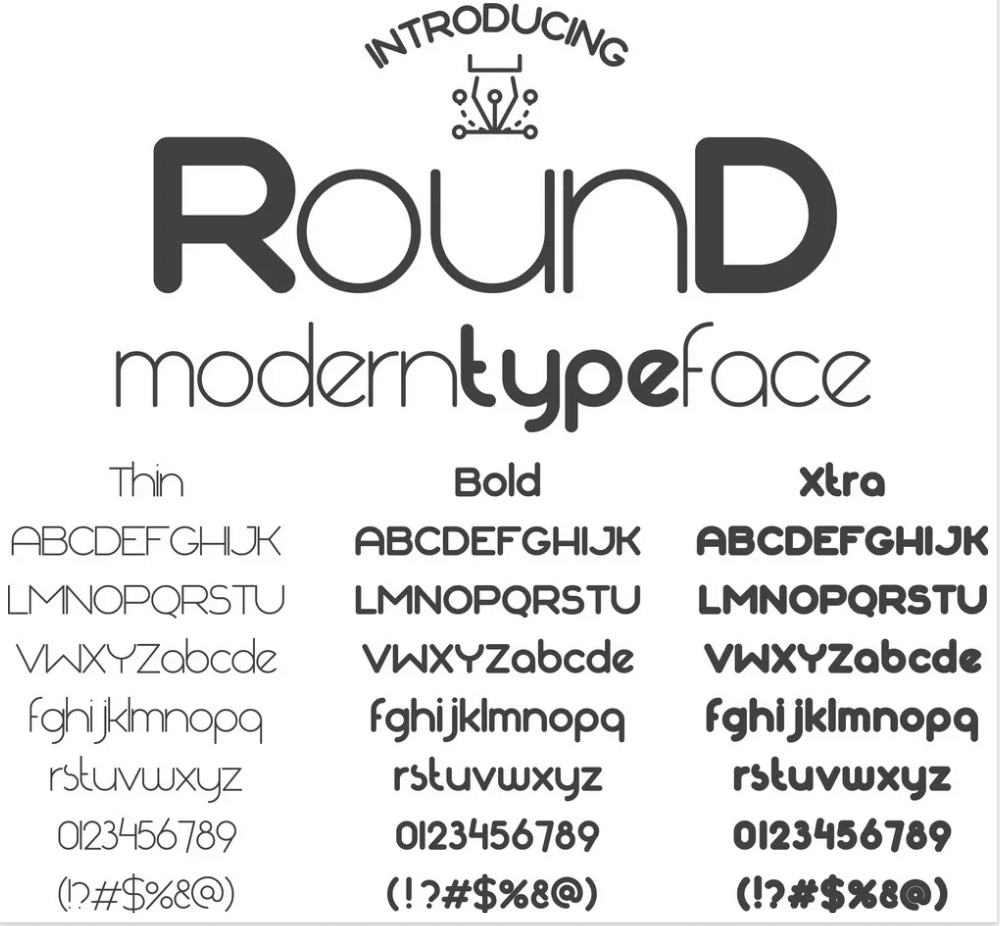
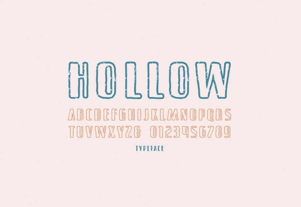
The following is a basic rundown of the font categories:
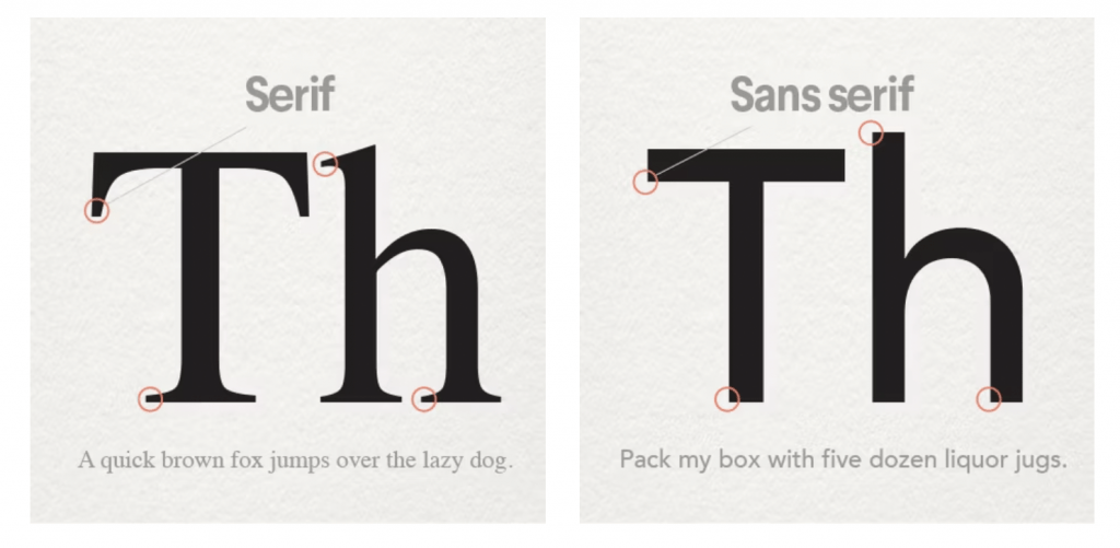
- Serif
- Classic, refined, conservative, tradition.
- Sans-Serif
- Modern, clean, geometric, simple.
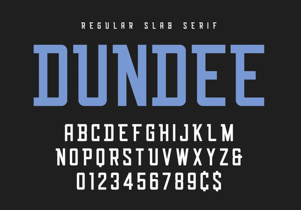
- Slab serifs
- Vintage, rustic, masculine.
- Script
- Refined, feminine, ornate, elegance.
- Handwritten
- Bespoke, custom, casual, approachable.
- Display: typewriter, novelty, everything else
- Funky, unusual

Check out these fonts based on the different styles mentioned.

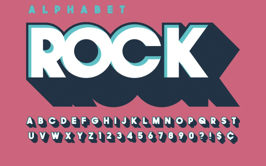
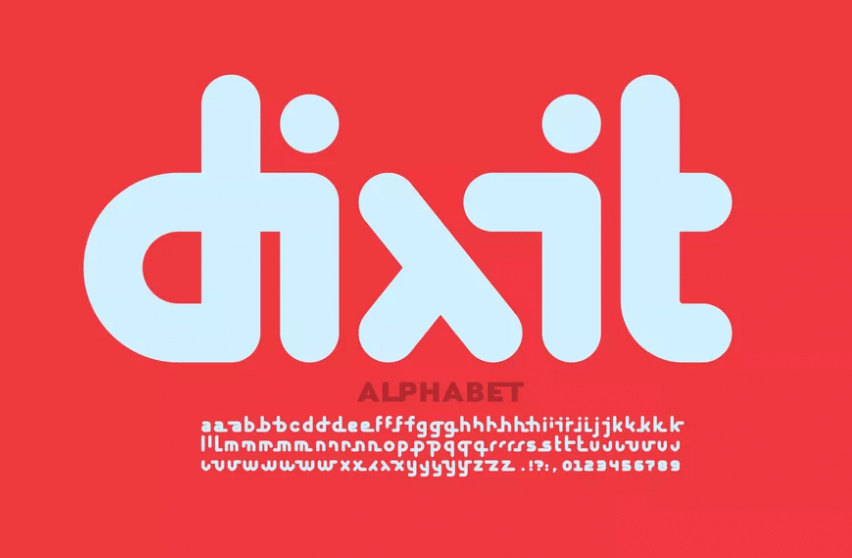
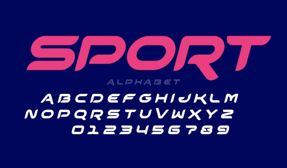
Font weight and style
Once you choose your basic font category, you can narrow down your selection further through style characteristics. Most fonts come in a range of subtle variations and weights—from hair thin to super fat and thick, condensed tight to wide and spacey. A thick weight might work great for a short name but could look too thick and bulky for a longer name. A thin font might look great on a billboard but also could vanish on a business card at a small point size. Thin fonts will always feel delicate and are better suited for a more refined logo, while heavier fonts feel more assertive.
Script fonts and how to use them in your brand
Your brand name is the place to use a font with the most character like scripts and hand-lettering. The supporting text should be the clearest: stick to the highly readable sans-serifs and serifs. This ensures a potential customer will be drawn in by your cool main brand font but the supporting information will quickly and cleanly communicate what you do. Never combine statement fonts like scripts—they have too much character and even if they’re different, hierarchy will be muddy.
Let’s start your logo design!
Font selection is always an important consideration for any project or design asset. But when it comes to choosing a font for a logo or brand identity, it’s imperative. While you want to choose a logo font you like and think is aesthetically pleasing, it’s also important to keep in mind the feelings and associations it will evoke for future clients and customers.
Use your brand’s values as your guide while following the above guidelines and you’ll be on your way to stunning logo design!
Want to learn more about logos? Check out our article on how to design a logo.
Our talented designers can make anything happen.
