How To Choose The Right Logo Colors
Before we can dive into logo color combinations, let’s consider how to choose a color scheme that works for your brand.

Know how many colors to use
As a general rule, use between one and three colors in your logo design. Since your brand identity contains your logo, be sure to pick at least one dominant color to appear across all your branding assets. When in doubt, keep it simple to maintain a clear brand message and persona.
With that said, some rules are made to be broken. Depending on your industry, business, and brand values, you’ll know if your audience would prefer a multitude of colors. Some colorful favorites include NBC, Google, Toys R Us, Crayola, NASCAR and Slack.
Understand the types of color combinations
Understanding the types of logo color combinations and how using complementary colors can help you strategically decide on your palette. Let’s go over them quickly:
- Monochromatic color combinations: One color scheme created using different tones of one color.
- Analogous color combinations: A color scheme (2 or 3 colors) that sit next to each other on the color wheel.
- Complementary color combinations: Colors that sit on opposite sides of the color wheel.
- Triadic color combinations: A scheme of three colors evenly situated around the color wheel. Each color is equal.
- Tetradic color combinations: A combination of four colors that are two sets of complementary colors.
23 inspiring logo color combinations
01. Purple and yellow-gold
Two highly-saturated colors instantly bring energy and life to this logo. The LA Lakers’ logo embodies the team’s vibe and symbolizes the energy and movement of basketball. Fans can easily recognize this lively logo color combination, whether in a packed stadium or on a single jersey—, an important unifying detail for a sports team’s fan base.
Since purple and yellow are opposite each other on the color wheel, they are complementary colors. Both purple and yellow are positive and confident colors, too, so they work well in sports logos, fitness logos and beauty logos.

02. Pink and blue
Technically speaking, pink and blue complement each other. However, many cultures see them as gendered opposites. The two colors create a balanced composition in the Baskin-Robbins logo. This palette communicates the beloved ice cream brand’s trustworthiness, dependability, and warmth—from their pink ice cream sample spoons to the blue text on their customer service page.

Here’s a fun fact: If you inspect the Baskin-Robbins logo, you’ll see the number 31 cleverly hides inside the letter B and R. This number represents each month’s 31 flavor offerings.
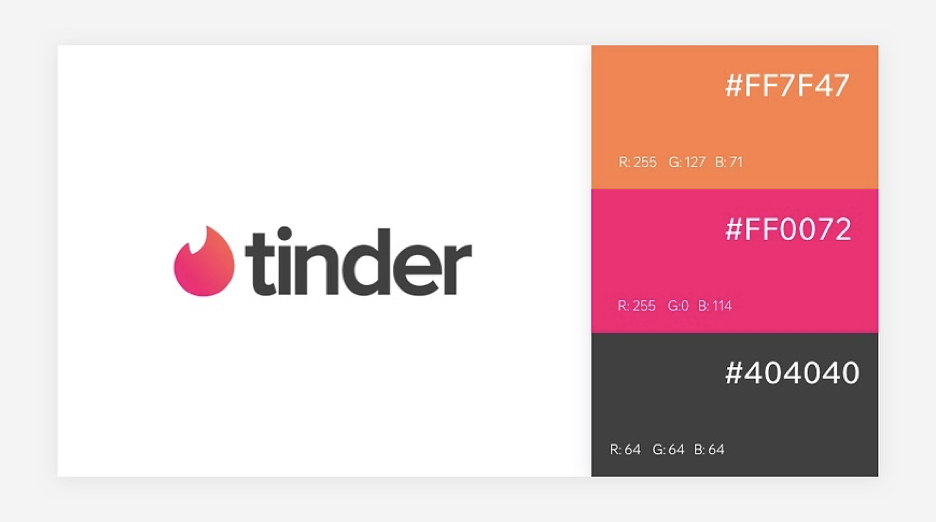
03. Orange and pink
Both warm and happy hues, the color wheel situates pink and orange close to one another. Since we know colors trigger emotion, what better way to use these bold colors than for those looking for love? The logo stands out in the sea of app icons, making it almost impossible not to touch—and literally play with fire.
A few other orange and pink logo color schemes worth mentioning: Dunkin and Priceline Pharmacy.
04. Blue and yellow
People associate blue with trust and yellow with happiness, so what better combo for Walmart, one of the most-trusted American brands? Blue and yellow are not quite complementary on the color wheel, but they balance each other out. Notice the IKEA logo slightly mutes the colors into almost subdued shades (true blue and ripe mango) making it accessible and approachable.
05. Black and white
Classic black and white is timeless, elegant and works across different industries. Zara’s refined wordmark logo is always recognizable against their brightly colored and patterned garments.
Pro tip: When you design a logo, always start in black and white. Color should come last. Your logo will likely not always appear in color format, depending on the medium, so have several color variations to ensure consistency, including black, white and monochromatic.
06. Red and white
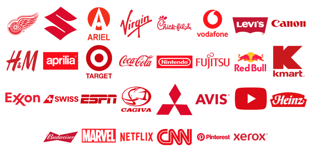
When combined together, red and white make pink. But when juxtaposed against one another, the colors create an eye catching result. Think about where you see red and white in life: stop signs, lighthouses, a lipsticked smile. These all instantly grab your attention. To jog your memory, here are a few other classic red and white logos: Coca-Cola, Target and CNN.
When using this logo color scheme, be sure to consider red’s emotional associations. Some settings and cultures connect red to danger and anger. If you plan to use red in your design, try different intensities, a subtle adjustment which can convey different emotions.
07. Muted Pastel Shades
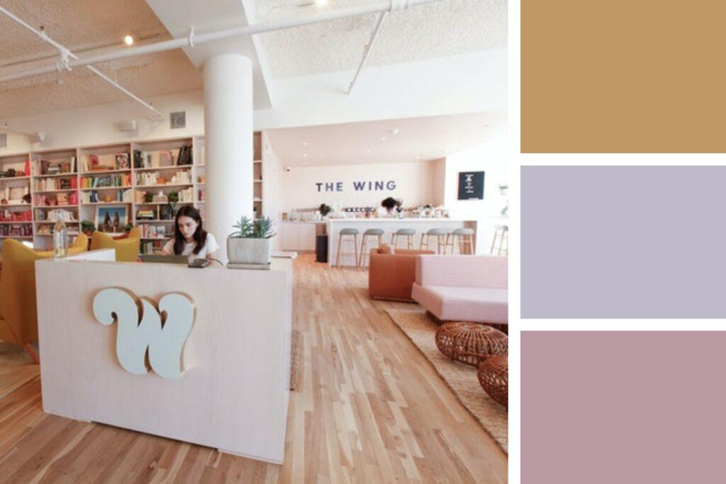
Not all pastel logos have to be bright and bouncy! You can opt for a more subdued pastel aesthetic that better suits your brand identity. The Wing is a women-identified-only social club and workspace based in New York.
World-renowned design studio, Pentagram, designed The Wing’s brand with sophistication in mind. Blending muted tones with fun pops of more vibrant colors to create a unique pastel aesthetic.
08. Forest green and neutral beige
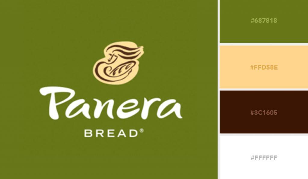
Here we have a soft, natural feeling color duo. Since green surrounds us outdoors, we associate it with growth, prosperity and renewal. This makes it a popular logo color choice for natural brands.
In this case, Panera successfully rebranded their previous black and beige for a more subdued visual identity —forest green and a neutral beige for a comforting and down-to-earth logo color combination.
09. Bright green and orange
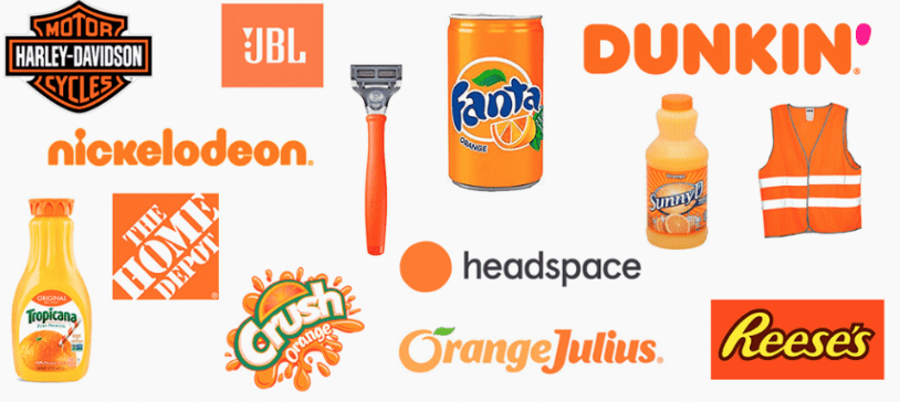
Another green logo, but a very different product and industry, this bright green still represents growth and development. Orange represents all positive things of life, be it zeal, charm, happiness, appeal, originality, vigor, and fortitude. Psychologically orange is a color of positive energy vibes, affection, and passion. Some motivational experts feel that orange emits kindness and power. The color arouses confidence, uplifting, and restoration.
10. Red and pink
Many, especially those in fashion, once considered the delectable pairing of red and pink a clashing faux pas. Since these two shades are so similar, they can compete with each other. So, when considering this logo color scheme, balance these hues to achieve a harmonious composition.
To pair these analogous logo colors successfully, try using muted or softer shades rather than two bright colors. Consider using gradients or choosing one dominant color and highlighting a second. Red and pink work well for fashion logos and beauty logos.
11. Neon green and black
While many may associate neon colors with ‘80’s ski jackets, the hues also can represent vitality and vibrancy. Pairing a bright color with bold black text helps anchor the eye and focus on the brand name. Neon colors can also represent warning signs and danger, so be sure to factor in balance if considering this for your logo design. Neons can work well in fitness logos or for young vibrant brands.

12. Mint green and bright pink
Think of a juicy watermelon slice or a long-stemmed pink rose and instantly you know these hues work together. This logo color scheme pairs a bright pink with a pale mint green to create a powerful composition. Since pink and green are complementary colors, they pair well in almost any shade, saturation or brightness.
Interestingly, the emotion they evoke can change dramatically based on the paired shades. You can easily play with this logo color palettes’ shades of pink, like bubblegum, salmon or coral pink and ranges of green like sage, olive or emerald.

13. Yellow and green
Another analogous logo color scheme, yellow and green evoke cheerfulness and youth. These colors both uplift the viewer and, when used together, effectively create visual harmony. For Sprite, the colors not only help the brand stand out, but foster an association to the product. The soft-drink beverage’s colors represent the refreshing citrus fruit shades and lemon-lime flavor.
Green and yellow logo color schemes often appear in the food and cleaning industries, as well as tourism, sports, and fitness.

14. Brown and white
Earthy and organic, brown is warm and engaging. The agriculture, construction and legal industries commonly use shades of brown, as do chocolate, coffee and beer brands. Brown evokes dependability, comfort, and even neutrality. In this case, the brown is used with a wood-grain pattern to represent the brand’s quality craft products and designs.
Using color in this simple way can effectively capture your intended audience and quickly communicate with them. In addition, brown can also sometimes evoke a throwback feel.
15. Black and yellow
If you’re not already humming Wiz Khalifa’s Black and Yellow, you might be when you think of this winning logo color combination. A range of logos and industries, and of course—Batman—use the strong color duo of black and yellow. Since many associate yellow with warmth, happiness, positivity and brightness, businesses choose this combination when they want to correlate their brand with these motifs.
To use this logo color scheme effectively, remember balance. Pay attention to spacing to manage contrast. You can read up on some good logo design tips to create a composition using black and yellow.
Pro tip: Always think about how different cultures may bring their own meanings and sensitivities to certain colors. For example, many cultures link yellow and black to butterflies and the hope and transformation they associate with them.
16. Orange and red
Many use the same logo color palette when they want to evoke a specific feeling. For example, the financial sector focuses on blue as consumers associate it with trust, dependability and intelligence. Mastercard’s fiery, vibrant red and orange logo stands out from the predominantly blue logos of Visa, Chase or PayPal. When designing a logo, always look at your competitors to find a common theme and identify ways to give yourself a creative edge.

17. Red and brown
Red and brown may seem like an unlikely logo color scheme duo, but the final design can be quite impactful. In regard to the Buc-Ee’s logo, the bright red pairs with a more caramel-colored brown to create a charming composition.
This combo successfully pairs one brighter hue with a more muted shade. This is because the vibrant red lets the warm undertones of the brown do their magic. The yellow color of the circle demonstrates cheerfulness and friendliness. It shows a place where you can relax. The black border makes it look like a road sign. The logo’s font is non-standard, like everything in Buc ee’s centers. The different size of the letters indicates a large selection of products and their sizes.
18. Red, yellow and green
When it comes to three color logo combinations, it can get a little tricky, but you can get it right if you understand each shade’s unique nuances. Monday.com’s bold tricolor logo hits the mark. The project management tool improves workflow and streamlines collaboration, so what better colors to elicit a response than those of a traffic light?
These three dominant colors embody the brand’s playful spirit throughout every brand identity and product detail.

19. Purple, gold and red
As the name suggests, Crown Royal is whiskey fit for royalty. How appropriate that the Canadian-based Whiskey uses royal purple, gold and red in their logo. In addition, the logo pairs an elegant cursive font with an ornate crown atop a velvet pillow. The imagery, colors and text all play their part in shaping the brand’s identity.
Purple palettes evoke wisdom and luxury, often appearing in food and beverage logos and also in children’s brands.

20. Green, purple and black
Another three color combo that uses purple, this logo color combination conveys a completely different message. Mad Hippie is a vegan skincare and cosmetic line, and as they put it, are “Hippies on a mission, taking care of one another regardless of gender, race, orientation, age, location, or even species.”
The brand pairs a simple black, typographic logo using a typewriter-esque font, with a purple and green shape representing a flower and a heart. Plus, they include a surprising pop of the same green on the tittle (the dot on the lowercase i). This sophisticated yet playful color combination powerfully reinforces the brand message.
Using colors in your text, symbols and logo shapes can help communicate your brand story and pique consumer interest.

21. Light aqua, red, black and white
This company took a risk and used a unique logo color scheme of two bold and bright colors sandwiched between black and white. (Remember, the general rule is no more than one to three colors.) And this four color logo paid off. The highly recognizable logo builds upon a simple note icon and TikTok wordmark.
The bright colors work as overlays, with small amounts of color pops energetically bursting out the sides. How fitting for a social app that lets users watch, create, and share 15-second clips of dancing, music, laughter and much more. Many users now associate these colors solely with the app’s icon, which sits on their phone menu icons, in their social feeds and in the background of their everyday lives.
The key to TikTok’s use of four colors is the balance, layering and contrast.

22. Blue, purple, pink, yellow and orange
Here’s another logo color scheme example that follows its own rules: Instagram. The colorful camera logo filled with a gradient color palette of blue, purple, pink, yellow and orange is now a globally recognized symbol. Kevin Systrom created the original logo—a Polaroid camera complete with a rainbow stripe—in 2010. Over the past decade, Instagram grew up, got acquired by Meta, and shifted from a simple photo sharing platform to video-sharing, Reels and more. Still, the company’s current sleek, refined logo maintains the original spirit.
Instagram evokes specific emotions and builds brand association through its colorful palette. The app builds upon a visual aesthetic, so having a logo that matches has contributed to the social platform’s success and brand consistency.

23. Red, purple, blue and green
UI and UX designers use Figma for digital design and prototyping, and their brand’s logo reflects their creativity through color. Playing with subtle gradient and bold contrast between color and shape, the Figma logo strategically communicates through design. The stacked colors resemble both a grid and the letter F, cleverly combining these details in a rather simple but strong layout.

